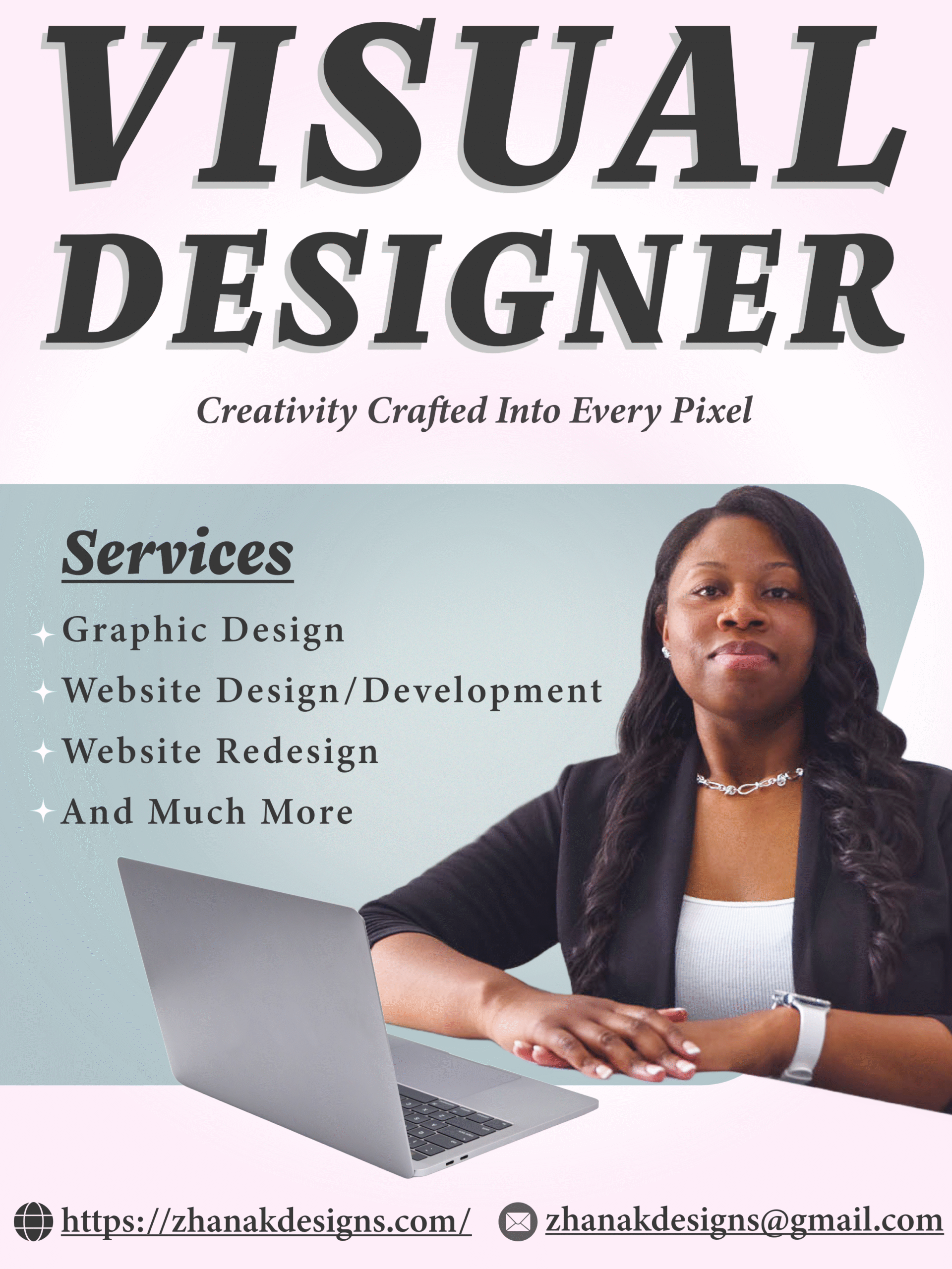
My Portfolio
Web and graphic design projects that showcase my creativity and skill.
Graphic Design
Crafting bold logos and intuitive websites that make brands stand out. From sleek visuals to functional designs, I deliver creative solutions with impact, using Illustrator, Photoshop, and Figma to bring every idea to life.
Logo Projects
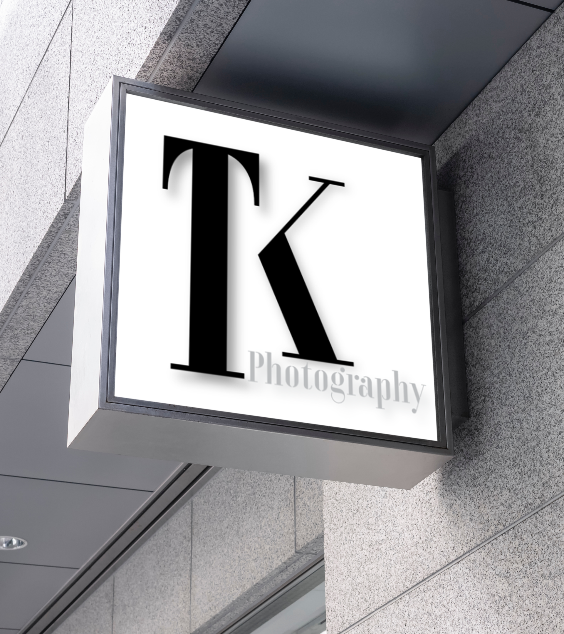
Photography Monogram Identity
Industry: Professional Services / Personal Brand
Tool Used: Adobe Illustrator
The Brief
Some brands don’t need to be loud to be noticed; they need to be precise.
The client set out to create a monogram that reflected three core values: minimalism, professionalism, and originality. But there was a challenge hidden within that simplicity.
Traditional monograms often lean on decorative typography and intricate details. This brand needed the opposite: something refined, intelligent, and quietly distinctive. A mark that wouldn’t compete for attention, but would earn it.
Strategy
The direction became clear: strip it back to its essence.
Rather than treating the initials as letters to decorate, they were approached as forms to construct. Geometry replaced ornament. Structure replaced embellishment.
This shift allowed the design to move beyond typography and into something more intentional, where clean lines, balanced proportions, and negative space work together to create meaning.
The goal wasn’t just to design a monogram, but to build a system of visual logic that feels deliberate and modern.
Process
Simplicity, when done well, is never simple.
Every angle, every intersection, every proportion was carefully considered and refined. The process became an exercise in restraint, removing anything that didn’t serve a purpose.
As complexity was stripped away, clarity emerged. The initials began to take on a stronger presence, not through decoration, but through structure and balance.
What remained was a form that feels effortless, but is built on precision.
Outcome
The final mark proves that less can say more.
Bold in its restraint and modern in its construction, the monogram stands as a confident expression of the brand. It feels elegant without being delicate, minimal without being plain, and distinctive without relying on excess.
It’s a logo that doesn’t follow trends; it avoids them.
Timeless, structured, and quietly unconventional, the identity captures a new kind of professionalism, one defined not by complexity, but by clarity.
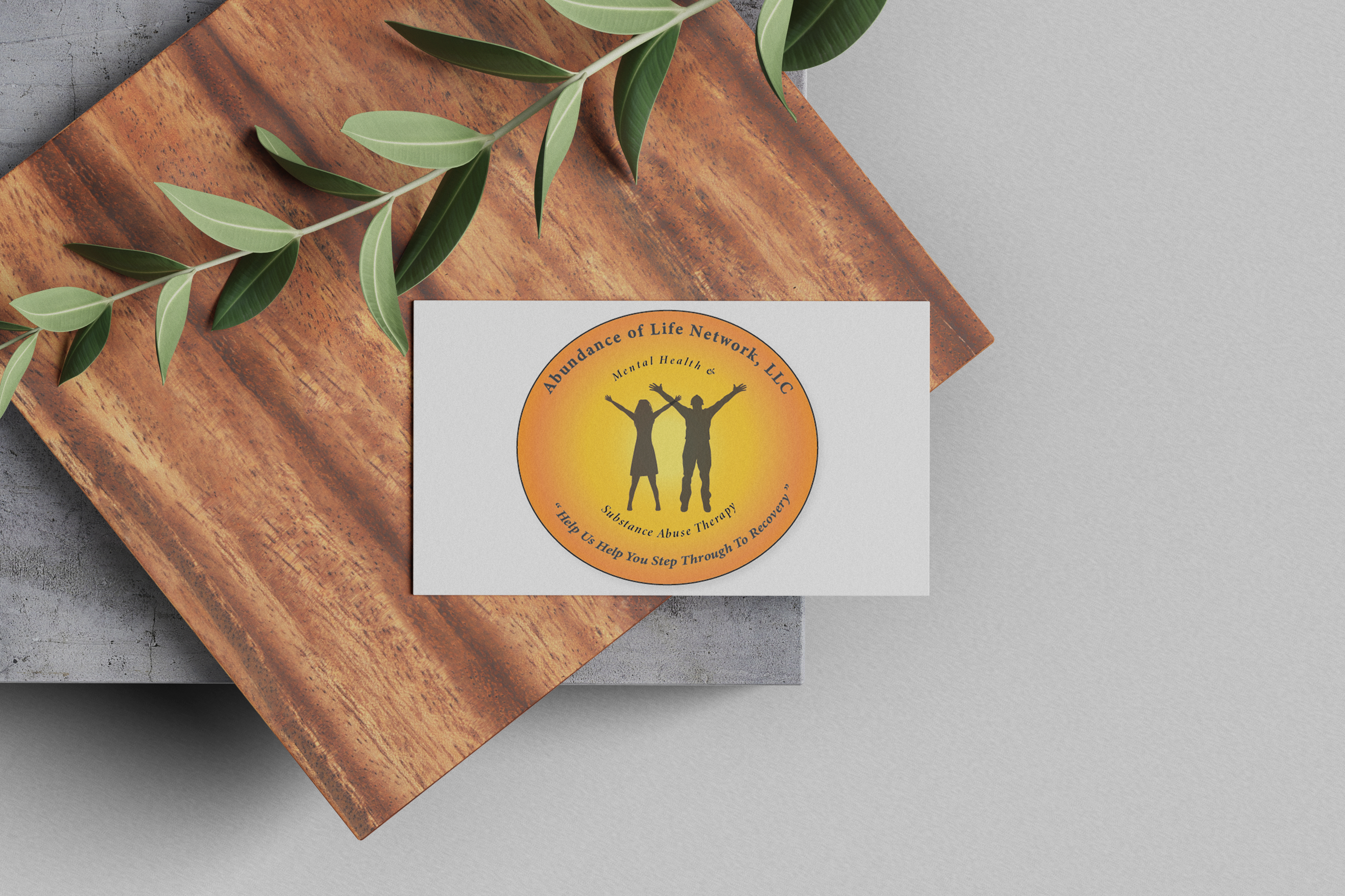
Recovery Brand Logo Redesign
Industry: Healthcare / Addiction Recovery Services
Tool Used: Adobe Illustrator
The Brief
The project began with a desire for change, but not reinvention.
The client’s existing logo already carried deep meaning, symbolizing growth, healing, and recovery. However, visually, it no longer reflected the strength and progress behind those ideas. It felt dated, and its impact had softened over time.
The goal was to modernize the identity, creating something cleaner and more contemporary while preserving the heart of what the organization stood for.
Strategy
Recovery is not a straight path; it’s a breakthrough moment.
That insight shaped the direction of the redesign. The concept focuses on two human silhouettes, a man and a woman, captured at the exact moment of triumph. With arms raised, they represent the point where struggle gives way to strength, where healing becomes real.
By centering the design around this emotional peak, the logo becomes more than a symbol. It becomes a story of hope, empowerment, and transformation.
Simplifying the forms and refining the composition allowed that story to come through with clarity and balance.
Process
The process was less about adding and more about revealing.
Each element of the original emblem was carefully evaluated. Anything that didn’t support the core message was removed. Shapes were simplified, proportions adjusted, and the composition refined to create a stronger, more cohesive mark.
This intentional reduction improved not only the visual clarity but also the logo’s scalability and versatility across different applications.
Throughout the process, the aim was to maintain a sense of familiarity while elevating the design into something more confident and enduring.
Outcome
The final logo captures a moment that words often can’t.
The raised silhouettes stand as a powerful symbol of breakthrough, resilience, and renewal, reflecting the journey of overcoming and the strength it takes to move forward.
While the design feels cleaner and more contemporary, it remains deeply connected to its original meaning.
The result is a timeless identity that not only represents recovery but also celebrates it.

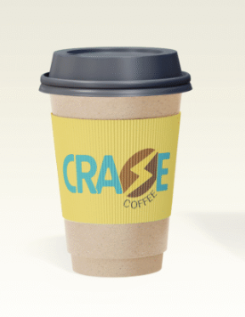
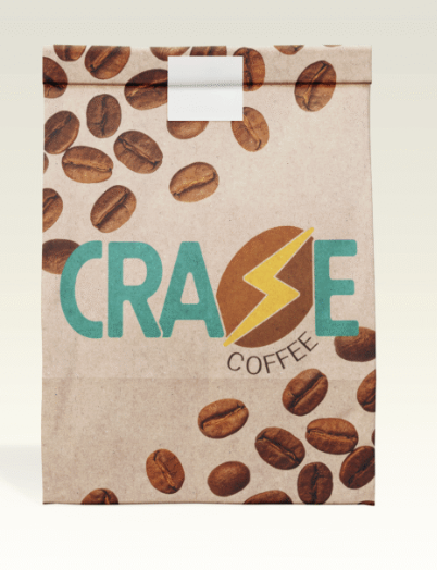
Craze Coffee
Industry: Food & Beverage/ Coffee Brand
Tool Used: Adobe Illustrator
Craze Coffee — Brand Identity
Coffee isn’t always calm. Sometimes, it hits like a switch.
Craze Coffee was built around that moment, the instant surge of energy after the first sip. Instead of leaning into warmth and comfort, the brand captures something faster, sharper, and more electric.
The name Craze reflects that heightened state: focused, energized, and slightly unstoppable.
That idea comes to life in the wordmark, where the “Z” is replaced with a lightning bolt. It’s a simple move, but it transforms the logo into a symbol of speed and impact, turning energy into something you can see.
The visual system builds on this with bold forms and vibrant color, creating a sense of movement and intensity while staying clean and adaptable across applications.
The result is a brand that feels immediate and alive, designed to stand out and to capture the rush behind every cup.
Graphic Design Work
Tool Used: Adobe Photoshop & stock photos
Clean, simple, and purposeful designs focused on clarity and visual balance. Work includes mockups, brochures, digital layouts, and product visuals.


Web Development
I build clean, responsive websites and web apps that look great and perform flawlessly. Whether it’s a dynamic web app or a sleek modern site, I use HTML, CSS, JavaScript, and React.js to create intuitive, engaging experiences across all devices.
Web Design Work
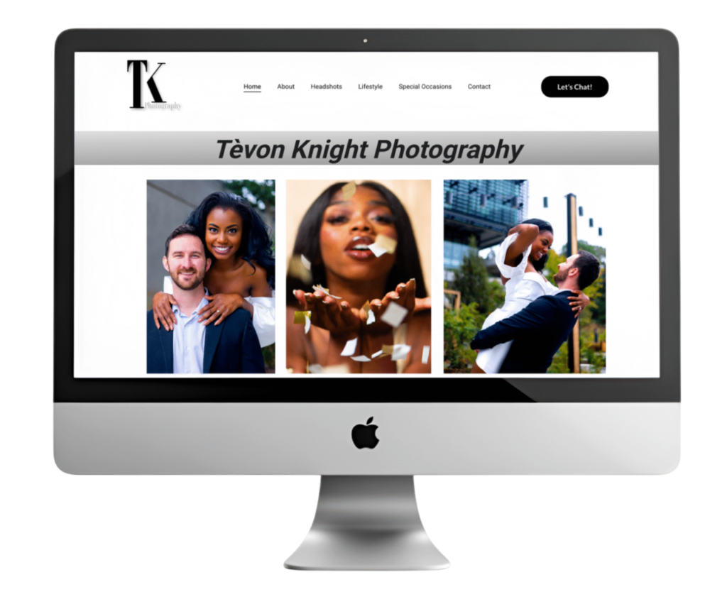
Photography Portfolio Website
Industry: Photography / Creative Portfolio
Tool Used: Figma & website builder
Overview
The client needed a clean, straightforward photography portfolio website to showcase their work across multiple categories. The primary goal was to create a minimal platform where visitors could focus entirely on the imagery without distractions.
Objective
- Present the photographer’s work in a clear and organized format
- Maintain a simple, modern, and intuitive user experience
- Support multiple photography categories for easy content separation
- Balance professional presentation with an approachable feel
Design Approach
The design embraces minimalism, using generous white space and clean typography to keep attention on the photography itself. A restrained layout and intuitive navigation system ensure a smooth browsing experience, allowing users to move effortlessly between galleries. The overall visual tone is calm and unobtrusive, reinforcing the focus on the imagery.
Features
- Category-based gallery navigation for structured browsing
- Minimal header and footer to reduce visual clutter
- Fully responsive layout optimized for desktop, tablet, and mobile devices
- Image-focused design that prioritizes visual storytelling
Outcome
The final website delivers a seamless and engaging browsing experience that highlights the photographer’s work without distraction. By combining simplicity with subtle personality, the portfolio achieves a balance between professionalism and approachability, effectively showcasing the work across all categories.
Let’s Create Something Great
Thanks for visiting. I enjoy working on new ideas and solving creative challenges through clean, thoughtful design.
If you have a project in mind or want to explore possibilities, feel free to get in touch. I’d be happy to help bring it to life.
Let’s connect and build something impactful.